
Diminishing Returns
For this commission, I had the privilege of collaborating with a team of professionals on a powerful documentary focused on the wealth gap in the DMV area—an issue that disproportionately affects African American communities. I was entrusted with creating a dedicated section of the film, where I contributed original illustrations and visual elements that aligned with the tone and message of the subject matter. It was an eye-opening experience that allowed me to use my design skills to support a cause rooted in social awareness and impact.
Inspiration Moodboard


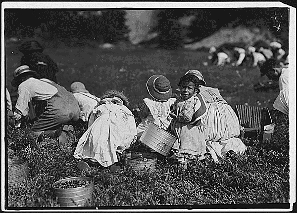
Images taken from National Archive to avoid copywrite.
First Look


Process
At the start of the project, I received the film’s script and was assigned a 10-second segment to visually represent. My task was to create a design that captured the emotion and meaning of that specific section. As part of my creative process, I began with sketches, exploring ways to visually express the tone of the subject matter. I then moved on to drawing the individual assets and carefully composing them into a cohesive illustration.
The result is the image you see here—designed using the film’s approved color swatches—which I prepared to present to the editor in our next production meeting.
During my meeting with the editor, I walked through my creative thought process, explaining how I used color to express the depth and seriousness of the wealth gap, and where I sourced the imagery and inspiration for the illustration. However, the editor felt that the design didn’t fully capture the gravity of the issue. While it was tough feedback to hear, it made me realize that visual storytelling, especially on sensitive, real-world topics, requires more than just aesthetic choices. It needs to convey urgency, truth, and emotional weight, and this pushed me to reevaluate and improve my work.
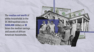
The Product


Using photographs sourced from the National Archives, I returned to the drawing board, determined to better capture the emotion and gravity the editor was seeking. I reflected on what truly makes a documentary powerful and realized that the raw, authentic struggle shown in historical photography couldn't be replicated through illustration alone. These images held a weight and realism that my initial design lacked.
To solve this, I began experimenting with the archival photos layering, adjusting, and blending them in Photoshop to create a composition that felt both impactful and respectful of the subject matter.
The result is the image presented here, a visual that finally aligned with the tone, truth, and urgency of the story being told.


The editor approved the revised image and was so impressed with the result that she requested it be animated for the final cut. I immediately began working in After Effects, transforming the still into a dynamic sequence that preserved the documentary’s raw, emotional tone. To deepen the impact, I layered in grain, noise, and a subtle grunge texture, capturing the feel of an old television broadcast and reinforcing the film’s connection to history and urgency.
The result is a powerful motion graphic that not only matches the tone of the film, but elevates the storytelling through intentional texture, movement, and emotional weight.
Results
The editor was so pleased with the final animation that she recommended me for the Student Success Spotlight at our university, a recognition that opened new opportunities and drew attention to my potential in film and motion design.
What I learned from this experience is that sometimes, illustration alone isn't enough, especially when dealing with serious, historically rooted subjects. In those moments, authenticity and emotional truth must take precedence. Design isn't just about creating something visually appealing, it's about honoring the story, the people, and the reality behind it.
